tata travel companion

OVERVIEW
A trip isn't one plan made in advance — it's a string of small decisions made the whole way through, from the moment you have the idea, to the last day on the ground.
tata travel is an AI-driven travel companion service, living in E-ticketing platform Triplabo, for all those decisions.
It enables travelers to get inspirations through maps, anytime and anywhere.
As the only product designer of tata, I designed end-to-end journey, deeply dived into AI content scoping, and just released MVP.
my ROLE
Product Designer
Competitor analysis
Prototyping
End-to-end journey delivery
Usability testing
AI prompting

Background
Explore new product shapes in Triplabo
Triplabo is Linktivity's self-operated travel ticket platform, grown out of its existing B2C business.
It carries 1,000+ products for a global market through a website and WeChat mini-program. Despite that catalog, repeat purchase sits around just 16%.
Heading into 2026, as the product catalog and B2C ambitions kept growing, Triplabo wanted to move beyond, and build real consumer brand and awareness.

Problem & Goal
Better experience for travelers, better business for Triplabo
To define the problem, we started from research in different aspects:
interviews with sales teams across different markets for firsthand pain points;
competitor analysis and an audit of SNS complaints about Japan trip planning;
Triplabo's own revenue data, which showed low repeat purchase and heavy clustering around popular tickets
Problem and goal point the same direction on both sides — enough to start shaping what this new product could be.


User Journey Mapping
Solving the anxiety on trip information
To find where pain concentrates in a trip, I segmented users into four types, then mapped one journey end-to-end.
Most pain points happen after collecting information, focusing on near & in-trip experience.
That gap led to one hypothesis for the new service:


Scenario Analysis
Post-purchase entry point as MVP
Building on the hypothesis, I mapped out tata's possible usage scenarios and their entry points, then scored each by priority, balancing user need, business potential, and engineering effort.
The post-purchase, before-the-trip scenario scored highest: users already have a booked ticket and time to fill around it. That became tata's MVP entry point.


Prototyping
Exploring the best map interaction
For new product idea, I usually prototype a lot before design in detail.
I vibe coded with Claude to explore the main interactive modal for tata, and then built a hi-fi prototype for user testing. I also added AI-generated da and Mapbox map to show real contents.
Check the final testing prototype here.


Usability Testing
Complete flows and better hierarchy required
We conducted usability testing with 5 users, focusing on product, information, and design feedback.
All users were motivated to explore tata, and the map gave them enough information and ideas — but more complete flows and clearer hierarchy were still needed to support their next action.


Design highlight
Map design: contrast and hierarchy
With the prototype tested, I refined the map details further.
I analyzed map apps, itinerary-planning apps, and even games to explore complex map design, then applied what I learned to give the maps more hierarchy and scalability.

Design highlight
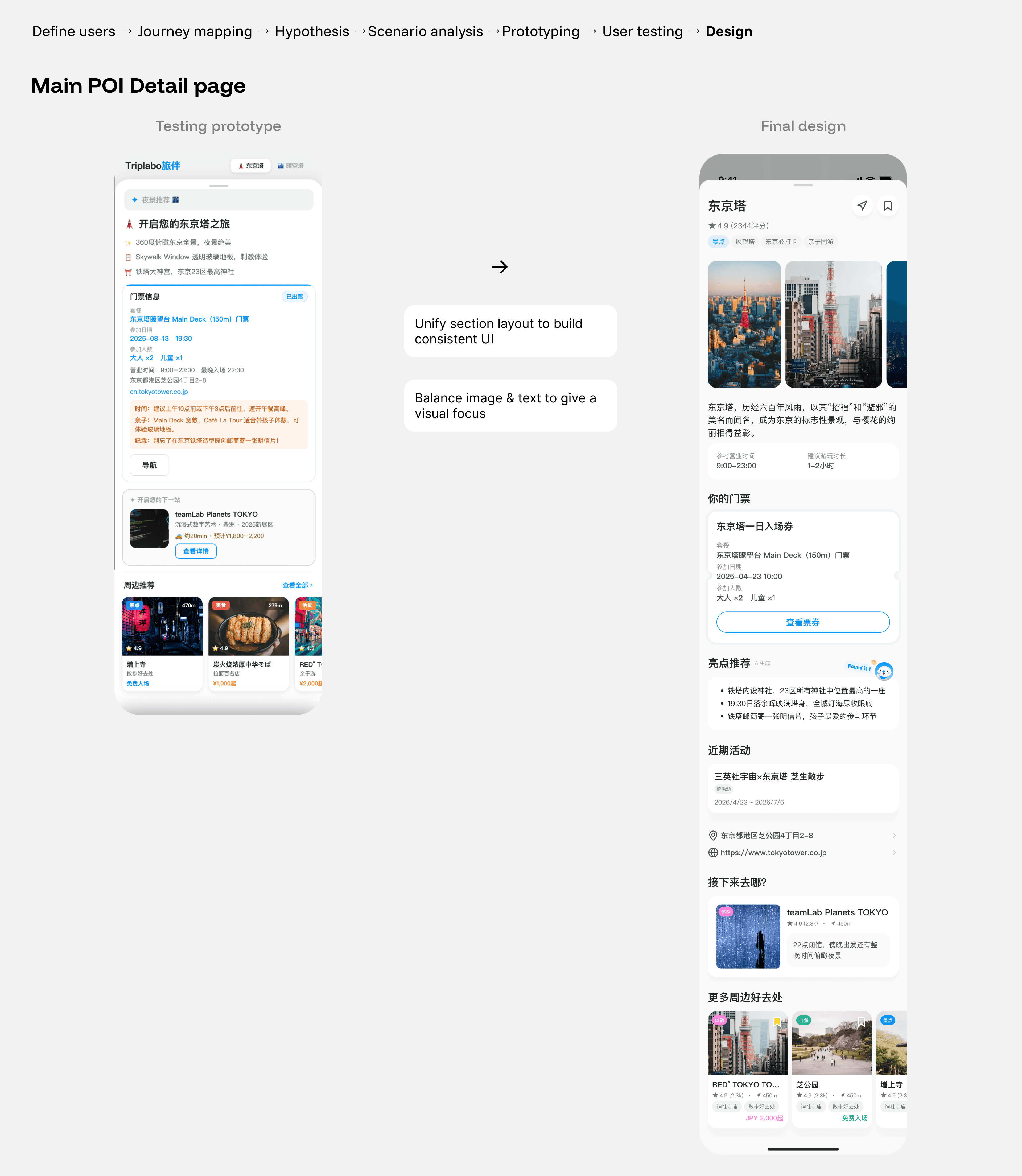
Detail page workflow: IA mapping → AI prompting → UI design
Detail page design is crucial for a content-heavy product like tata.
I started from IA mapping to clarify the data flow of detail pages, then built components and templates for each case.

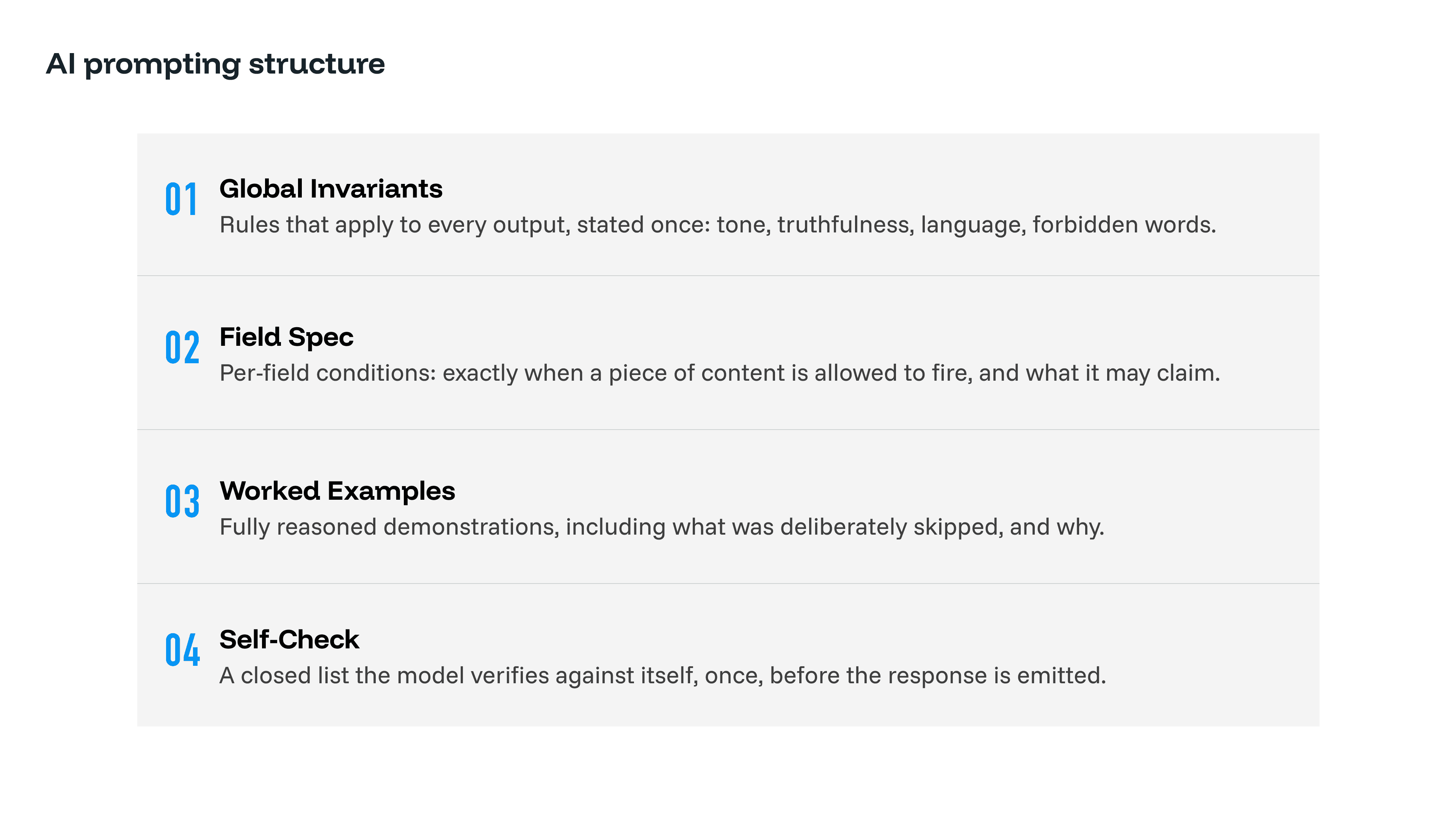
A unique task for tata is AI prompting. To keep POI content real-time and dynamic, I set specific fields to be AI-generated rather than manually written.
The prompting structure has four layers:
Global Invariants
Field Spec
Worked Examples
Self-Check
I iterated on this structure against real POI outputs before finalizing it. The process taught me how to design AI-driven features for a real product, not just prompt for ideas.

reflections
Build a 0-1 product with AI
We released the tata MVP in August, and are now collecting usage data ahead of a second round of usability testing.
Further design exploration is underway for the pre-purchase entry point and multi-POI ticket display on the map.
tata is live, but this still feels like the beginning.
Shipping the post-purchase scenario let us test the hypothesis with real users and real data. What we learn next will shape how far this goes, from the pre-purchase entry point to becoming a fuller, more personalized companion across Triplabo.