Industry
Travel
Client
Linktivity
Role
Product Design
Tata - AI Travel Companion

CONTEXT
To the next Destination with Tata
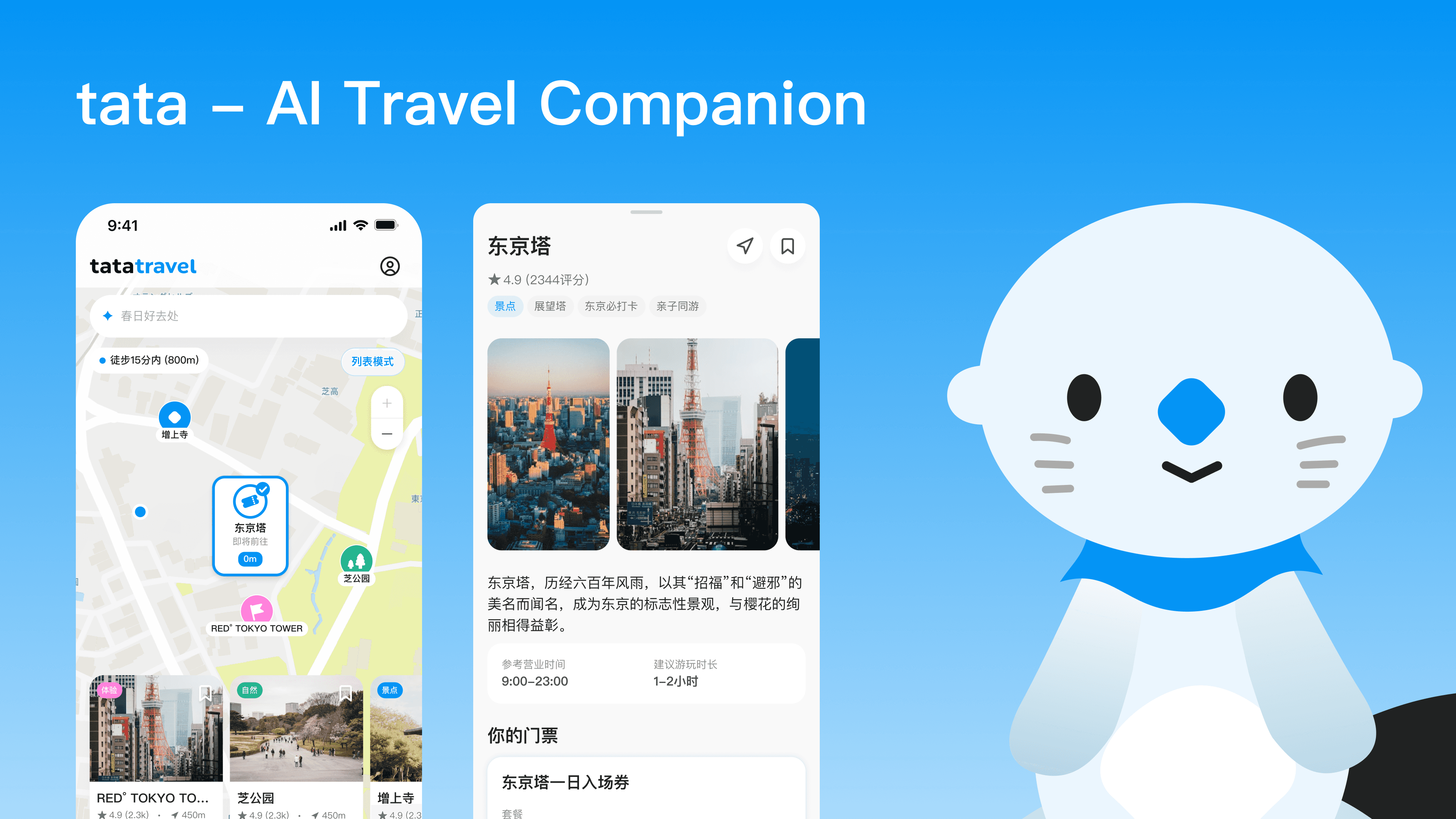
Tata is a new AI-driven Travel companion service, living in existing E-ticketing platform Triplabo. It enable users to get travel inspirations through maps in different stages of travel.
As the only product designer of tata, I designed end-to-end journey, deeply dived into AI content scoping, and just released MVP for post-purchasing entry point.

PROBLEM STATEMENT
More personalized recommendations, Less personal actions
On the customer side, the journey map shows content built to inspire but not to decide — users seed interest and research itineraries through scattered SNS content in the early phases, then hit purely functional touchpoints (transit, hotel, attraction ads) once they're moving, none of which help them re-decide when a plan breaks mid-trip.
On the business side, the connection diagram shows the same disconnect at the company level: separate purchase channels never route users into a shared exploration-and-repeat-purchase layer, so it's awareness, not supply, that's capping cross-sell and repeat purchase.
Both point to the same opportunity: a layer that meets users at the moment they actually need it — around a plan they've already committed to — is also the layer that could connect Linktivity's existing channels into repeat, trackable behavior.

DESIGN HIGHLIGHT
Scenario mapping
Scenarios were mapped across pre- and in-trip stages and validated with a low-fi prototype. I prioritized the post-purchase scenario for MVP — it starts from a confirmed booking, so it generates the user data personalization needs from day one.

DESIGN HIGHLIGHT
Prototyping & User Testing
I used Claude to build the hi-fi prototype and tested it with 5 users on map interaction, card placement, and gamification. All confirmed the need for this scenario and validated map-based interaction — but revealed how much nuance this model needs: familiar map controls, exploration-sparking (not just relevant) recommendations, and gamification that’s dosed just right.

Design Handoff
E2E design: exploring on map and POI
E2e design for MVP release, built around the map and a modularized POI detail page (different POI types get different sections, not one fixed template). The map uses a custom Mapbox style and three fixed zoom tiers — 800m walkable, 2km/2 stations, 5km/5 stations — to keep recommendations focused on what’s actually reachable from a user’s committed plan, nudging toward action over passive browsing. Competitor analysis and layout testing shaped a POI page that’s informative, local, and dynamic.

closing
Phase 2 scoping: itinerary × post-purchase scenario
This started with two gaps — users who get inspired but rarely commit, and a business whose channels don't route people into repeat purchases — and a hypothesis that a map built on real POI content could close both.
Phase 2 scopes the simplest slice first: one ticket, one POI, real nearby recommendations, before expanding to multi-POI tickets and full multi-product trips.
Next up is usability testing post-release, more entry points, and eventually treating POI as a reusable piece across every B2C service. Meeting users right after they've committed to something is the moment most likely to turn browsing into action — this is the first step toward proving that at scale.