Industry
Travel
Client
Linktivity
Role
Product Design
Linktivity Ticketing Platform Redesign

CONTEXT
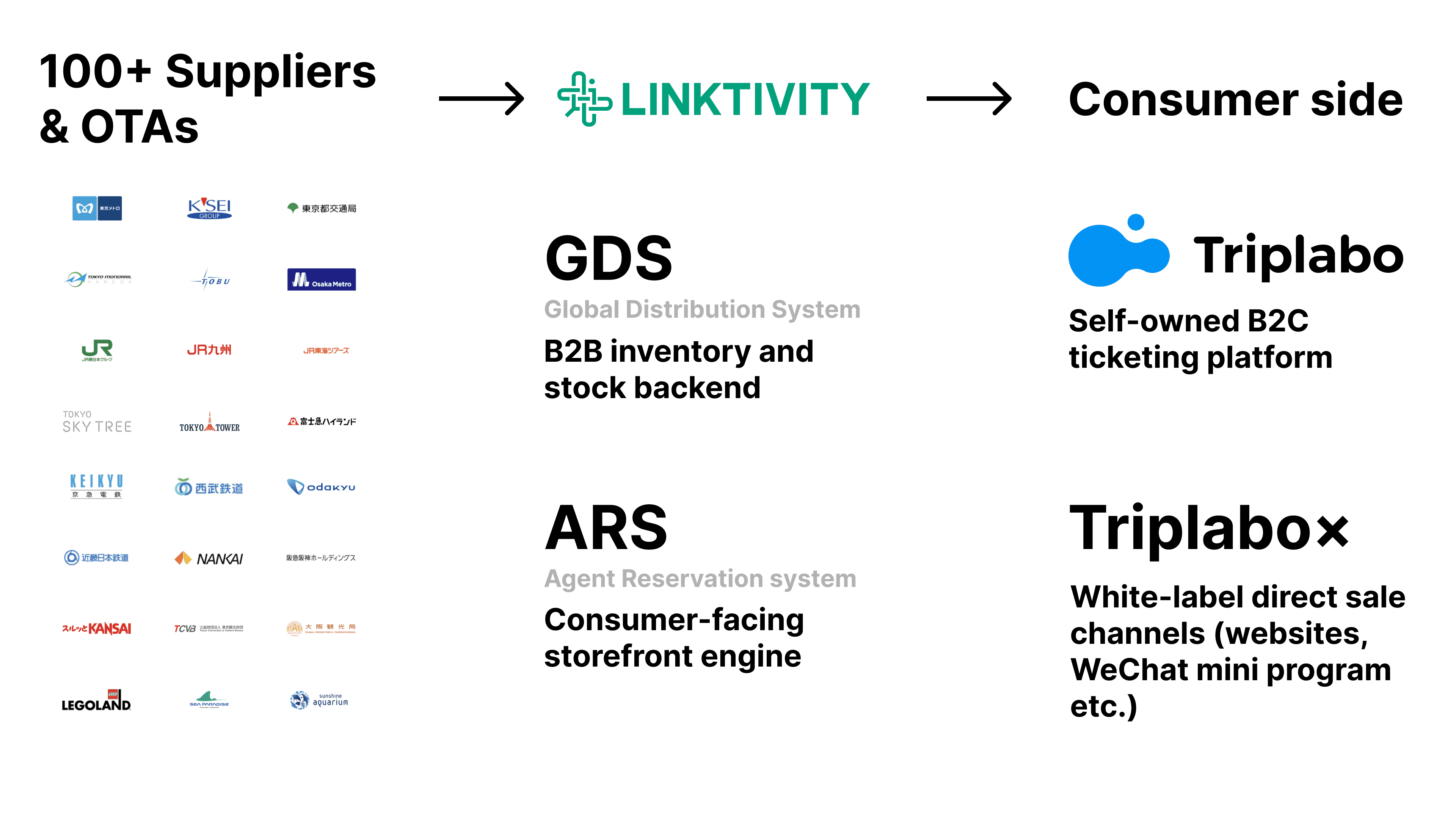
1 Platform, 2 Sides, 130+ Clients, 1M+ Monthly Users
Linktivity runs a white-label E-ticketing system for travel agencies and suppliers, including B2B inventory and stock backend, and B2C direct-sale storefronts.
As the only product designer across both sides, I owned the end-to-end redesign of this system since 2025, and rebuilt a basic ticketing e-commerce platform for efficiency and consistency.
PROBLEM STATEMENT
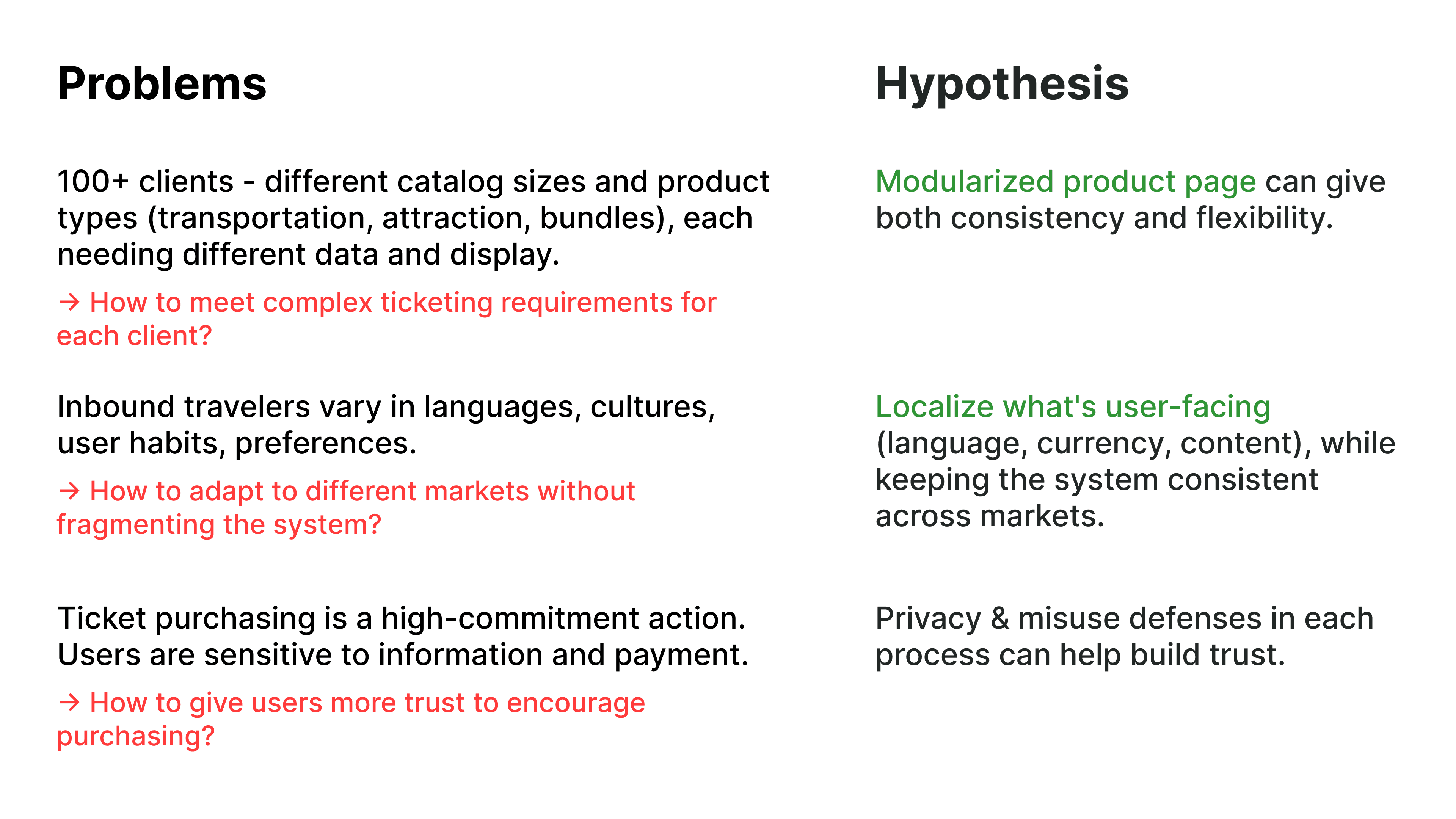
Complexity, Consistency, Localization
Our previous system was built 5 years ago, without a systematic view at that time. With limited research resources, I worked with PdM to clarify the whole system in backend and front end, and also interviewed BDs to get the first-hand pain points for each market.
I finally narrowed down 3 hypothesis, 2 of them are most likely to be solved by design: modularization design, and localization experience.

DESIGN HIGHLIGHT
The Product Page That Had to Do Everything
The product detail page is the flagship artifact of this redesign, and the hardest single information-hierarchy problem on the platform. One page resolves single items, bundle products, recommended products, and add-on options — for clients ranging from a single ticket type to fifty.
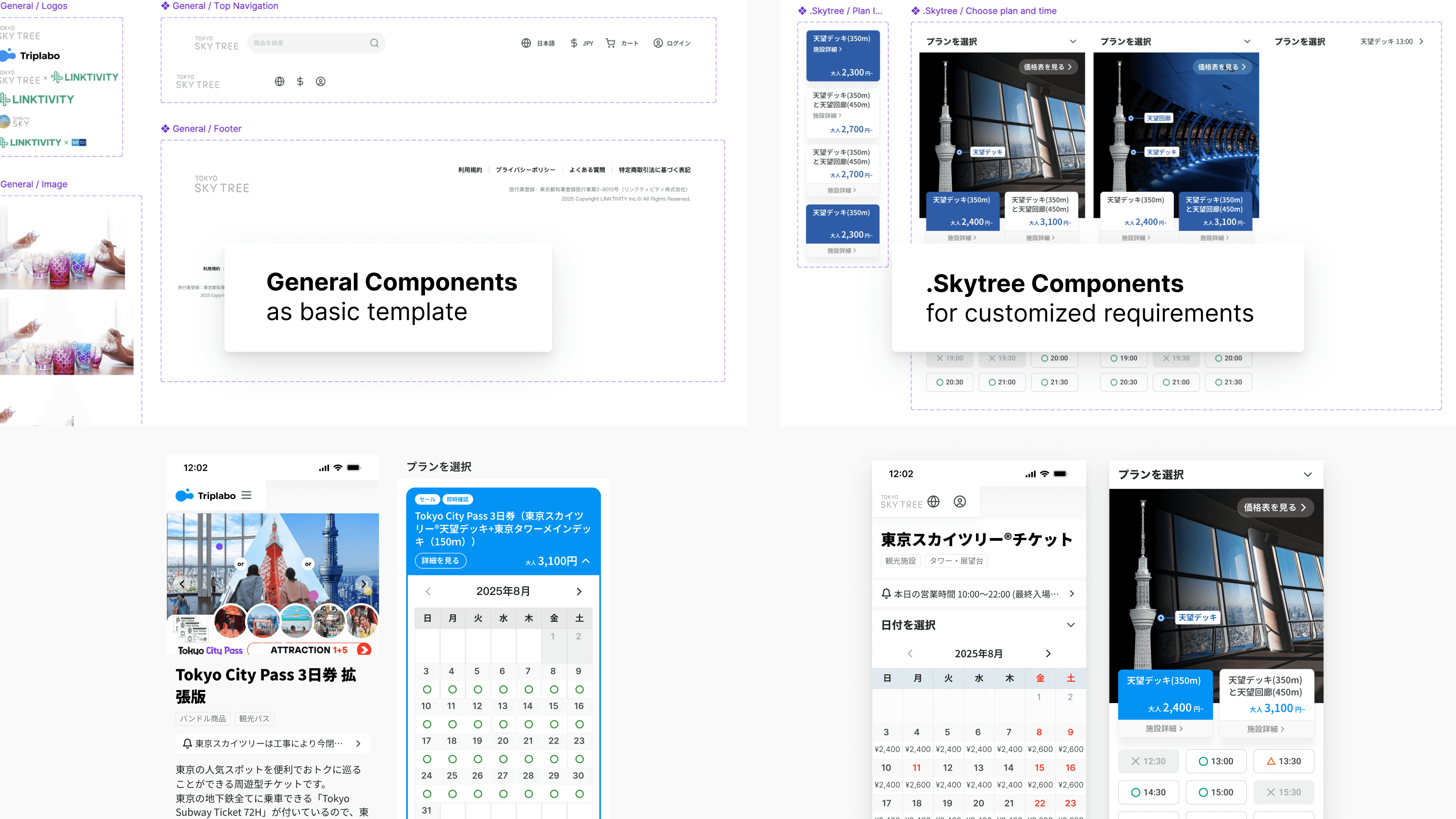
The final template handles plan selection, calendar availability, ticket-tier pricing, add-ons, and recommended products across desktop and mobile. With modularized sections, it can also fit for customized layout requirements from big clients like Skytree.

DESIGN HIGHLIGHT
Multiple Currency Display Challenge
For global products, localization happens everywhere.
One hard design task is proper currency display: settlement always happens in yen, so whatever currency a user sees while browsing is a converted estimate, not the actual charge.
Rather than hide that gap, prices display in the user's selected currency through checkout, with a disclaimer that final settlement is in yen and the rate may shift slightly — then order history and receipts switch to yen after payment, matching what was actually charged. A small piece of UI and copy, but the difference between a user feeling informed and one who feels short-changed.
Currency and language became separate selectors: prices can be browsed in a chosen currency, while a clear notice explains final settlement in yen and any rate changes. The same underlying components powered both a standard template and the heavily customized Shibuya Sky storefront.
Design Handoff
Building Components with Structure
I created one main component library for common template, and allow satellite components for different clients. This gives flexibility and consistency to the whole project, while also clear enough for hand-off.
closing
Design Thinking in System Over Screens
The achievement was systematic thinking rather than any single screen: holding a consumer storefront and B2B inventory backend in mind at the same time, for businesses with very different needs. The key limitation remains the backend product-data model; the next step is cross-functional work to make distinct product types easier to represent.