Industry
Finance
Client
HSBC
Time
2024
Role
Product Design
Easy Invest Redesign
OVERVIEW
Red or green — that's the first thing every investor sees when they open a trading app. But it doesn't say what to do next.
HSBC Easy Invest is one of Hong Kong's leading stock brokerage platforms, trusted by users largely because of HSBC's banking reputation — yet it has lagged behind in trading experience.
In 2024, the platform began a revamp to give users a new journey: easy access to all key features from the landing page, with a more personalized experience.
my ROLE
Product Designer
User research
Competitor analysis
Prototyping
End-to-end journey delivery
Usability test scoping
Accessibility Design

Problem Statement
Provide Proprietary Intelligent Data to Traders
This project began with a business question: how do we make Easy Invest a premium digital broker?
It is too broad to answer directly, so our design team ran a workshop in Hong Kong, interviewed relationship managers, mapped user journeys with stakeholders, and brainstormed with the project team.
From that, we landed on our North Star:
Delivering value for money
with proprietary intelligent data solutions that
help high-value traders find their next winning trade

Turning that North Star into a design challenge was the hard part.
Revisiting existing user research, I found a 2023 report showing 22% of users found Easy Invest difficult to trade with — largely due to how information was displayed.

Hypothesis
Information + Interaction
After further analysis and discussion with the project team, I scoped the problem into two layers: information and interaction.

IA Mapping
Restructure the Financial Data
For an information-heavy product, IA mapping is always my starting point. I audited the app's full structure to map out what information existed and where.
I also benchmarked leading brokers like Futu and IBKR, and found they use a nested structure rather than a flat one — a pattern Easy Invest hadn't adopted.
Financial data demands accuracy, so I worked closely with PMs and business analysts to understand every data entry.
The stock quote page, for example, used to be a long scroll of 10+ data points with no way to navigate quickly. I regrouped them into sections, and added display rules by user segment.

Prototyping
A More Professional Detail Page Layout
With the new IA in place, I prototyped two layout options, testing navigation and CTA placement with the design team and colleagues.
The trade-off was design polish versus business priority: 75% of trading volume comes from the top 15% of premium traders, who value efficiency over visual simplicity.
Option 1 was more visually approachable, but option 2 kept existing habits and organized data more professionally — so we chose option 2.
UX Design
Micro-Interactions: Compact, Dynamic, Personalized
For the new landing page, I followed a similar process — IA mapping, then prototyping.
But with 10+ entry points to fit on one screen, the real challenge was interaction: keeping the page compact and dynamic while still feeling personalized.

UI Design
Think Globally, Design Locally
This project raised a challenge unique to global products: balancing HSBC's global design system with the local needs of Hong Kong investors.
Research shows real regional differences — Asian users prefer condensed layouts and smaller fonts, while premium HK traders want more information visible at once to support faster decisions.
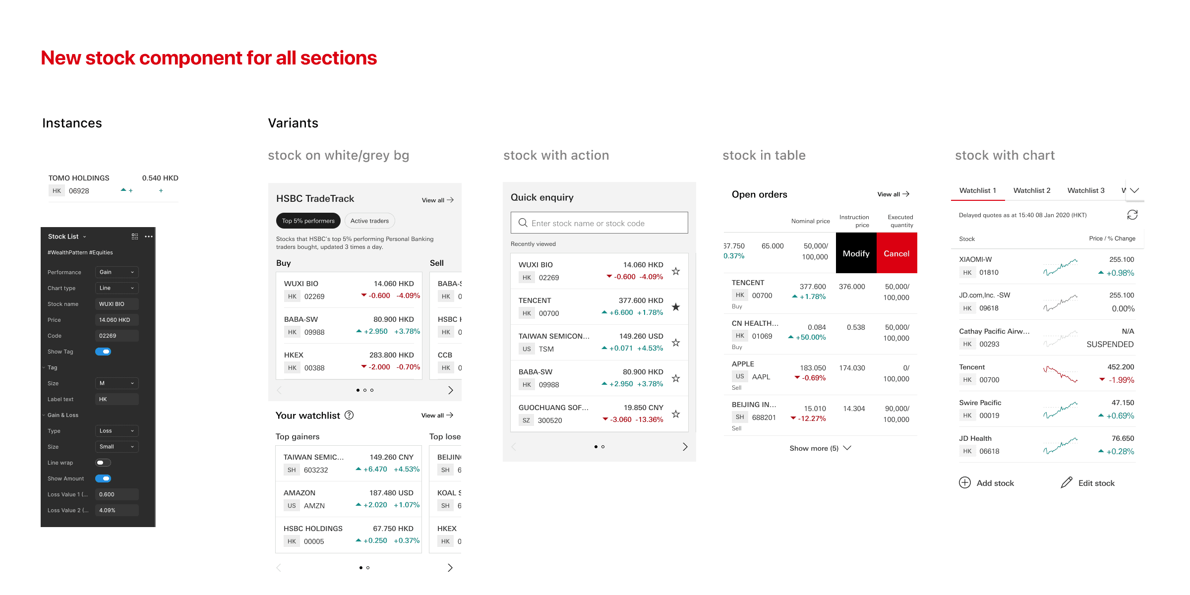
To bridge this gap, I:
introduced new components and variants to the global design system for dynamic stock displays
ran regular syncs with the global team to align on the right patterns for HK.
This became a valuable exercise in adapting a global design system to a complex local market.

Hand-off
One More Thing: An Accessibility Annotation Process
I also built an accessibility (a11y) annotation process to close a recurring gap: designers typically don't catch a11y issues until QA flags them post-development — costly to fix late.
I learned WCAG guidelines, explored Figma's a11y tooling, and introduced an annotation step before hand-off, which cut QA feedback significantly and saved the team time.
I shared the process with the global design team and pushed for it to become standard practice.
Result & Validation
Usability testing
I delivered 2 main journeys and 20+ supporting ones, covering all new sections and entry points.
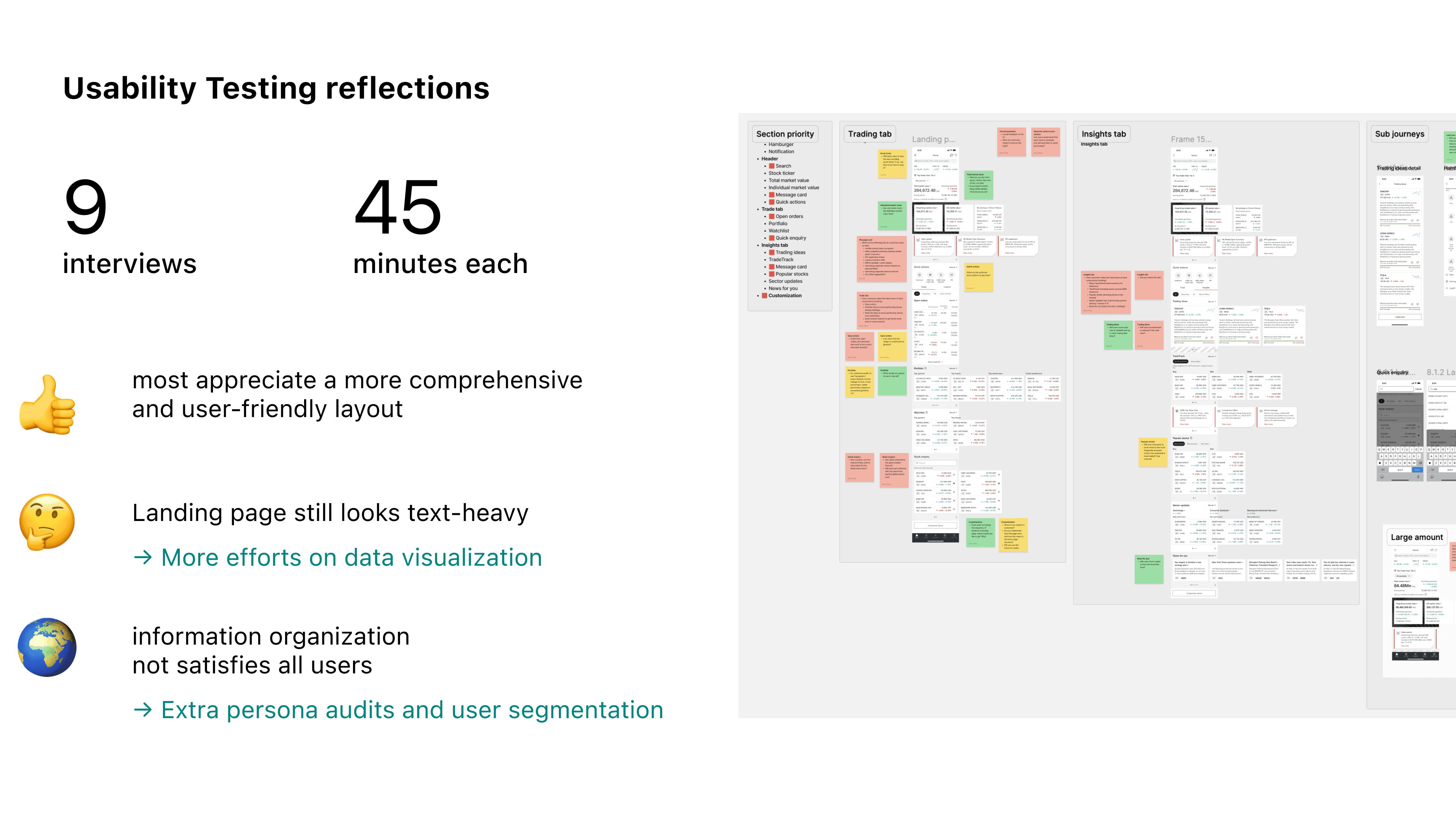
Before release, I scoped usability testing with the design team and partnered with research: we interviewed 9 users on the final prototype and found:
— Most found the new layout more comprehensive and user-friendly
— The landing page still felt text-heavy and needs simplifying
— Information organization didn't satisfy every user — more segments are needed
This project shipped shortly after I left HSBC, so I don't have post-launch data. I'd want to track trade completion rate, time-to-decision, and adoption of the landing page's new entry points.
Introspective
Design for Complex Information & Financial Product
Reflecting on this project, I learned a lot on how to design for complex information, especially in financial products:
How to approach IA mapping for complex layouts?
Audit the full structure before touching UI — nesting only helps if navigation evolves with it.
How to make trade-off decisions in financial design?
Let segment data, not personal taste, resolve the tension between design and business goals.
How to design for the decision moment?
How to design for the decision moment: interaction and personalization matter as much as information in turning "I see the data" into "I'll act on it."